Context
Our team designed and built both marketing site and purchase path for The Old Vic, going through a full process of user research, discovery workshops, wireframes, design, build and testing.
The purchase path is facilitated via Skyway, our own events management product which hooks into The Old Vic's ticketing CRM Tessitura. This project took place over the span of a year.
Tasks
My role
The design team on this project consisted of a lead designer, myself and a junior designer. The lead designer led discovery, as well as wires and design of the marketing site, while I carried out a supporting role.
Meanwhile, I was principally responsible for the design of the new purchase pathway and gathering requirements for customisations to Skyway.
My tasks
- Carrying out pre-discovery user research tasks such as an analytics review, UX review, journeys audit and moodboard.
- Supporting our lead designer during virtual discovery sessions carried out with the client (user personas, user journeys, card sort and content hierarchy)
- Planning and setting up a tree test on Optimal Workshop
- Scoping out customisations needed for the purchase path based on our baseline Skyway product, including an access scheme, membership journeys, seat map, and a brand new loyalty scheme
- Wireframing and designing the purchase path according to functional requirements and digital brand styles as defined by the marketing website
- Documenting designs and liaising with developers
- Testing built components and journeys
Challenges
An intuitive purchase path that’s still on brand
Old Vic’s iconic brand is heavily typographic, relying on extended type and a largely black-and-white colour scheme. My task was to ensure the brand would be translated truthfully across the purchase path, ensuring a consistent user experience.
Solution
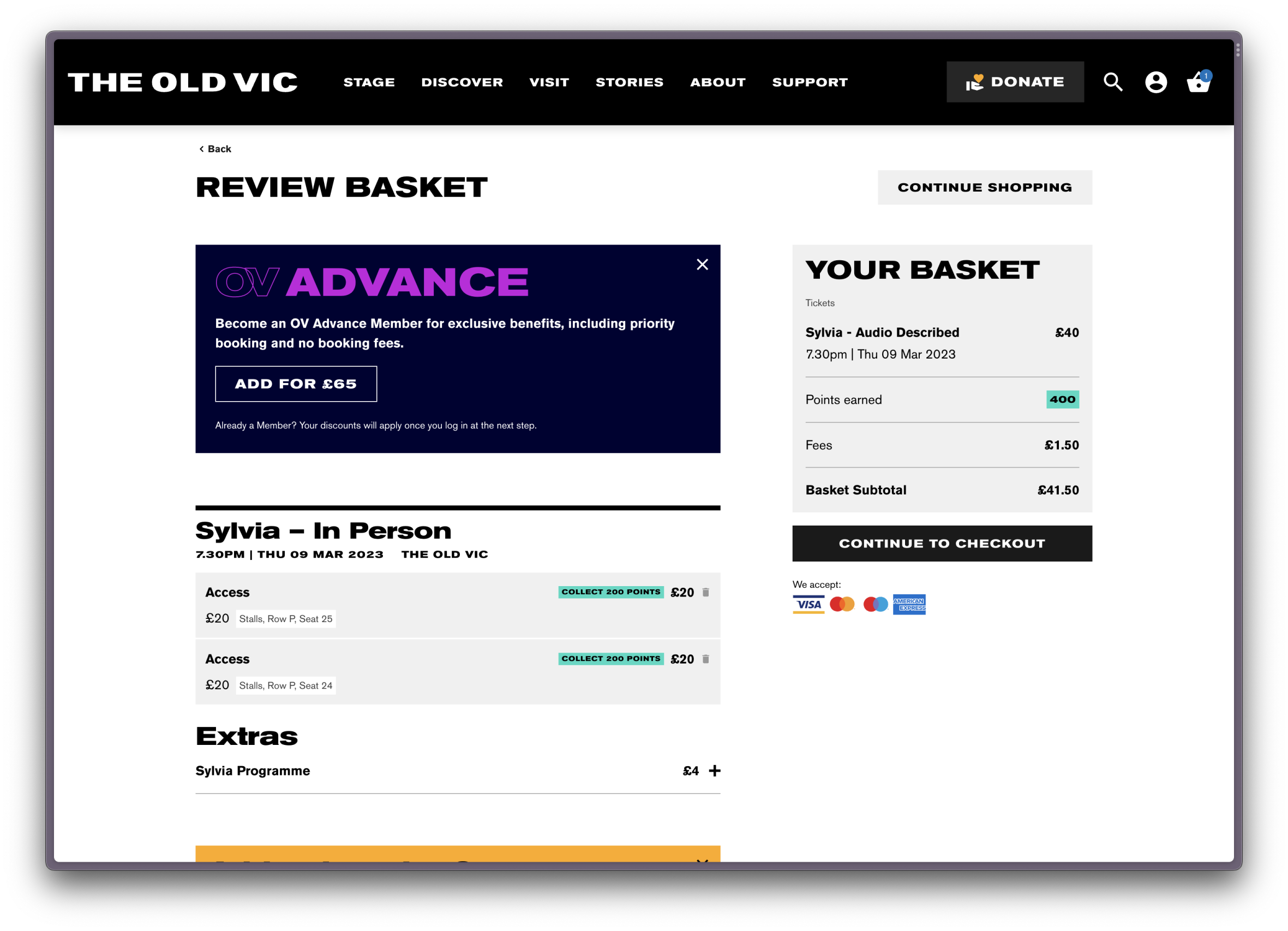
Information-dense pages such as the basket page could easily feel overwhelming and unintuitive if branding was applied too heavily. A careful balance had to be struck.
I limited the use of the extended type to event titles, using overlines and minimal card styles to separate units of content. Colour was used sparingly, and mostly in the context of The Old Vic’s sub-brands (Loyalty and membership schemes). As a result, users are able to associate colour schemes to distinct product offerings, all while ensuring other indicators were present, keeping the purchase path accessible.
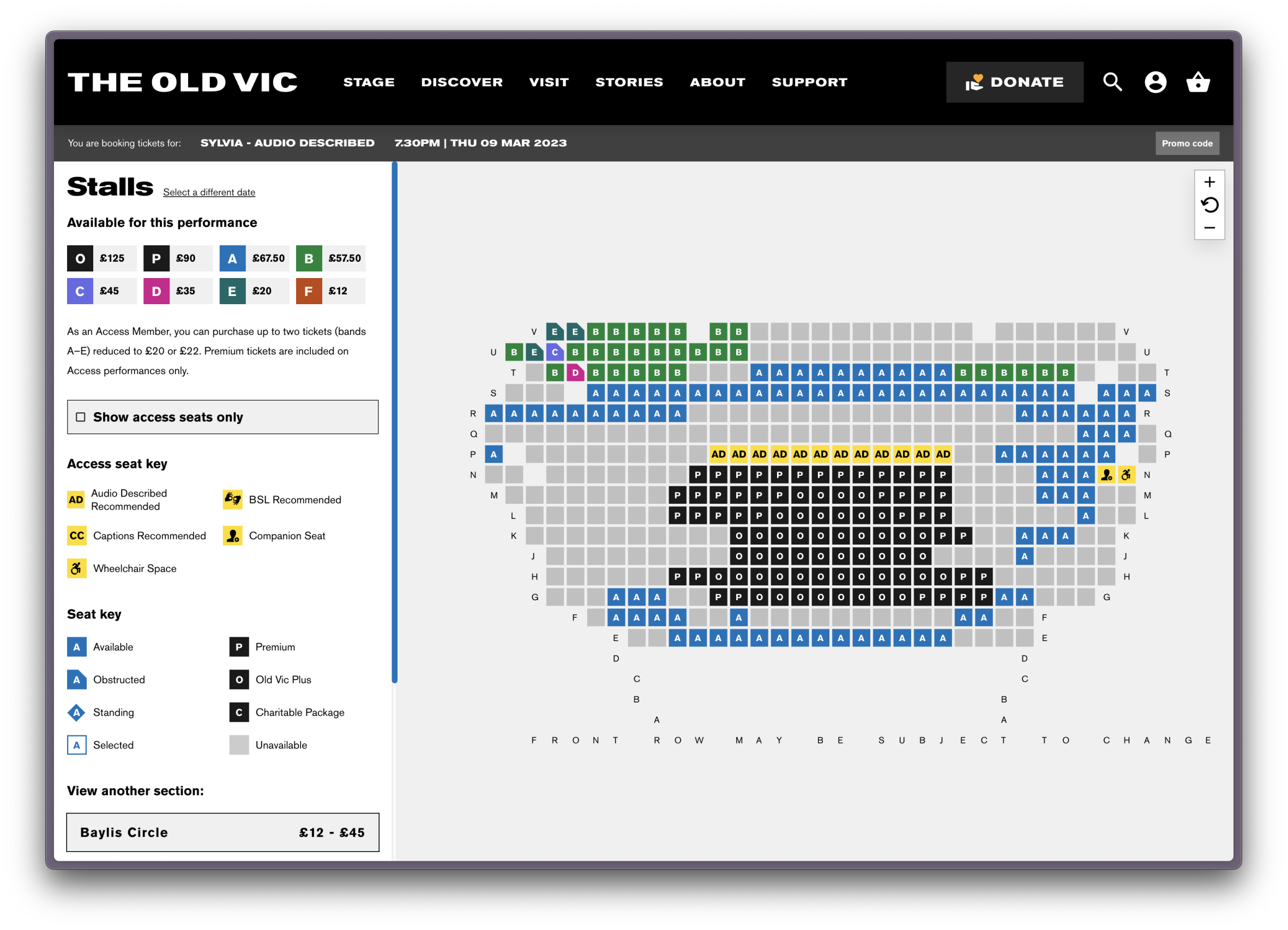
Surfacing accessibility-friendly seats on the seat map
The Old Vic has a generous access scheme which allows those with a (free) membership to pick whichever seat best suits their needs for a reduced price. Some seats have additional designations such as offering an ideal view of the BSL interpreter, which needed to be highlighted to access members on the seat map.
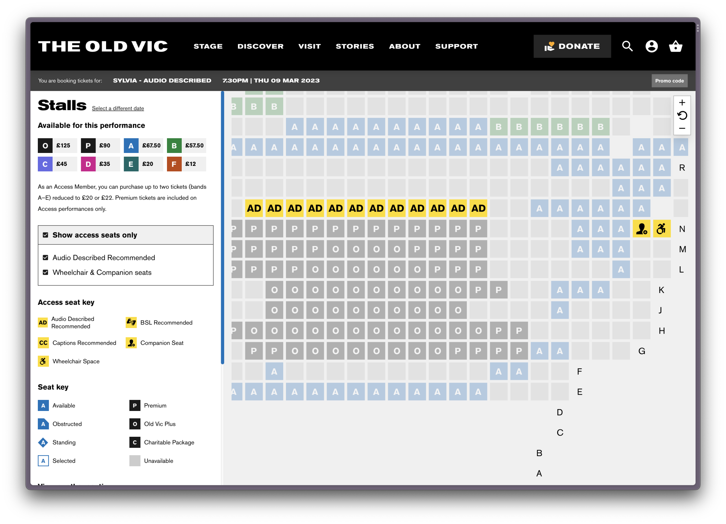
Solution
If users are logged in with their access membership, the seat map displays a toggle which allows users to filter for seats which are most fitting for their access needs. This feature required close and careful communication between myself, back end and front end developers, our project manager and the client, as the seat map set up in the client’s CRM determined how this feature could be built.
Initially, I designed a more complex version of this feature which would have included a wider-reaching access toggle, though we changed course due to technical limitations of the CRM. Nevertheless, the new seat map represents an improvement in the user experience of access users, and, together with other access-focused features such as an events calendar which can be filtered for access performances, works to reduce friction for disabled users in particular.
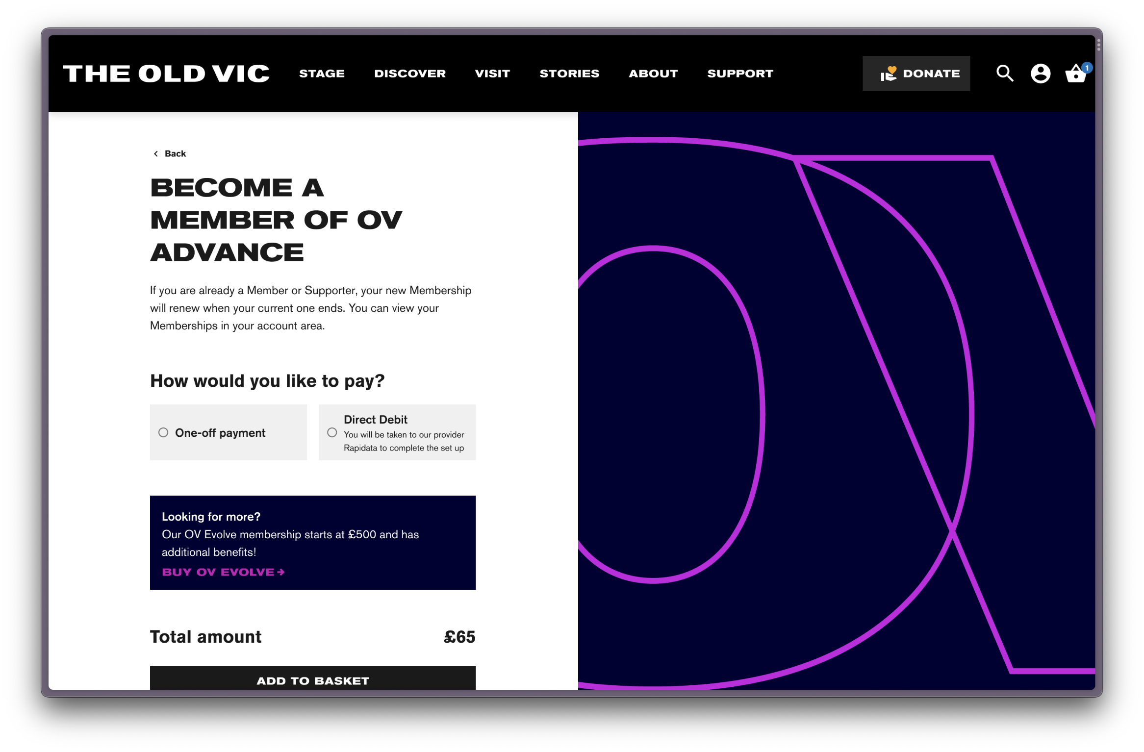
Membership journeys which encourage to give more
Being a charity, memberships make up a significant percentage of The Old Vic’s income. With each membership level having its own unique branding associated with it, including different minimum payments, tax deductible amounts and optional donations, this functionality required a lot of careful consideration.
Solution
During our research phase, we learned that users often failed to see the appeal of memberships, so I employed a variety of strategies to better communicate the value of a membership at key points of the user journey, such as a basket upsell for the lowest membership level, giving users immediate access to benefits such as priority booking and removed booking fees.
Each membership has a distinct colour scheme. I designed the membership purchase path to feel streamlined and premium, with steps revealed progressively to make the process of capturing information a breeze. Copy was fine-tuned to balance usability with legal requirements and the Old Vic’s ambitions.
Reflection
This was a highly successful project and I enjoyed the challenge of applying an impactful brand to a number of functionally dense journeys.
We took great care in providing a friction-free experience to access users in particular, and were able to play to the strengths of the brand to ensure users would have a consistent experience as they move between marketing site and purchase pathway.